
-
What is @media CSS property in lighting Style ?
What is @media CSS property in lighting Style ?


Log In to reply.

Popular Salesforce Blogs

Agentic AI in Software Development: What’s Changing?
It seems like just yesterday when enterprises had started to embrace AI agents in full swing. Yet the fact remains these agents are quickly being…


Learn All About Salesforce CPQ Discount Schedule
Discount Schedule refers to the discount on the Products based on some particular criteria like Quantity of the product that customers buy, Term of subscription…


Defining Salesforce Marketing Cloud Engagement and Why It's Crucial For Businesses
Salesforce Marketing Cloud Engagement previously known as Marketing Cloud Email Studio can play a critical part in a company's marketing strategy, helping develop client connections…

Popular Salesforce Videos

Is Salesforce A Good Career Path?
Join this useful group for Salesforce job & career info: https://tinyurl.com/TelegramIntelogik Contact us for any Salesforce career guidance. Watch this video and learn. do let…

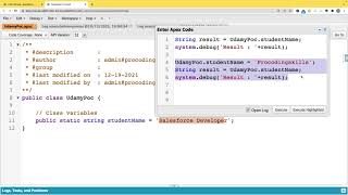
Salesforce Apex Class | Salesforce Development | SFDC Development
This video covers how to create an Apex Class in Salesforce and Execute the Apex Class. Do let us know in the comment section if…


Redefining the Digital Landscape With Our Innovative Salesforce Solutions
Watch this video to learn how Grazitti has been empowering Salesforce users' marketing journey with their Salesforce capabilities and Salesforce-native and Lightning-ready custom solutions, that…
